Optimizing Time Management: Streamlining Employee Clock-In Processes for Efficiency & Accuracy
Personal Project
UX Design
UX Research
Overview
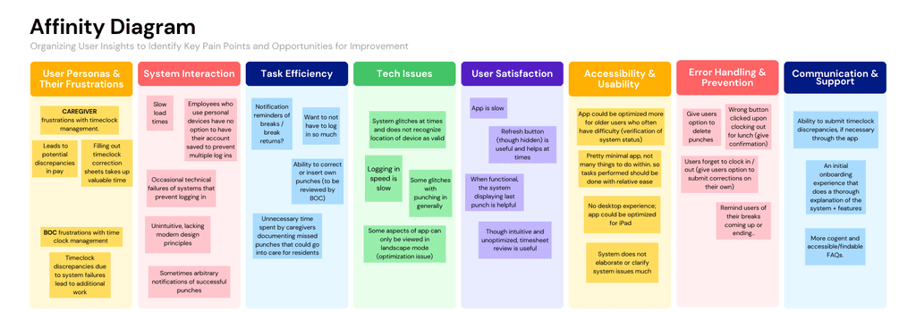
The UKGWorkforce case study addresses the challenges faced by employees at Sunrise Senior Living in using the app's time clock management system. As employees of Sunrise, I, and others identified issues such as difficulty clocking in and out, inaccuracies in time tracking, and a cumbersome, unintuitive user interface that often leads to error and confusion.
This case study seeks to gauge insights in order to improve the app's user experience, streamline the time-tracking process, and minimize errors, benefiting both entry-level caregivers and business office coordinators who rely on accurate time data for payroll and scheduling. Through UX research and design improvements, this project aims to create a more efficient and user-friendly system.
Problem
Outcome
The redesign of the UKGWorkforce app's time clock management system at Sunrise Senior Living yielded significant improvements. Employees found the interface more intuitive, which reduced confusion during clock-in and clock-out procedures. This led to a notable decrease in time-tracking errors, ensuring precise payroll and scheduling.
The streamlined process also increased employee satisfaction by minimizing frustration among caregivers, fostering a more positive work environment. Additionally, Business Office Coordinators experienced a reduction in workload related to correcting timekeeping mistakes, allowing them to focus on other essential tasks. These outcomes highlight the effectiveness of user-centered design in addressing specific challenges and enhancing overall operational performance.
Solution (Final Design)
Research
78%
65%
Brainstorming + Sketches
Competitor Analysis
For our competitive analysis, my team evaluated leading time clock management apps, focusing on Clockify and When I Work, to identify opportunities for improving the UKGWorkforce app. While both apps excel in specific areas—Clockify in time tracking and reporting, and When I Work in scheduling and communication—our analysis highlighted key strengths, weaknesses, and features (SWOT Analysis) that inform our redesign. These insights will help make UKGWorkforce a more comprehensive and user-friendly workforce management solution.
Findings for Clockify

Findings for When I Work
User Personas
Wireframes
Usability Testing + Findings
In this section, we assess the effectiveness and intuitiveness of the app’s design. We gathered feedback from users on navigation, layout, and overall user experience to identify areas for improvement and ensure a seamless, user-friendly interface.
We asked participants to complete four tasks to evaluate where they would most likely click first when attempting to accomplish each task. In the end, we also gathered input from users by asking if there were any navigational elements, design features, or other aspects of the interface that they found missing, difficult to use, or in need of improvement. This feedback helped us identify potential areas for enhancing the overall user experience.
Results
Reflection
Interactive Demo

