Revitalizing User Experience: Enhancing Accessibility, Trust, & Ease in Online Marketplaces
Solo Student Project
UX Design
UX Research
Overview
This project tackled the challenge of updating Craigslist's UX without alienating its current user base while making it more approachable for new users. I sought to balance modernization with the preservation of the brand's identity, which is minimalist, simplistic, and functionality-focused. Highlighting the question of whether Craigslist might be missing out on potential users due to its outdated interface is an excellent way to show the project's real-world relevance.
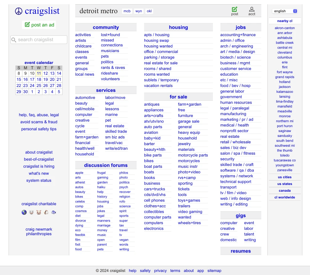
The site needs a complete revamp of its information architecture, organization, and mostly text-based interface.
Problem
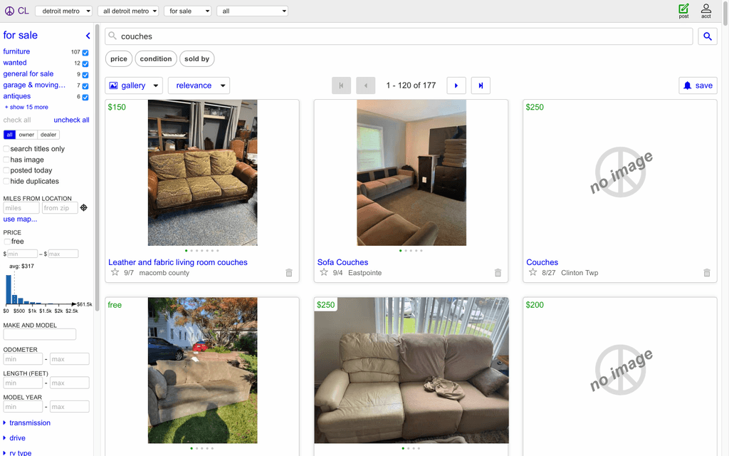
Craigslist possesses a variety of UX challenges, including a dated interface misaligned with modern web standards, an information overloaded homepage lacking clear architecture, heuristic violations affecting interaction design, navigation, and UI as well as visibility issues like the obscured search bar and essential features blending with textual links.
Outcome
Using a user-centered design-thinking process, I guided trashMob from conceptualization to high-fidelity prototypes. Through competitive analysis, literature reviews, user personas, and usability testing, I identified key user needs and iteratively refined design decisions.
By simplifying user flows and prioritizing intuitive interactions, I ensured the app addressed pain points effectively. This iterative approach resulted in a polished solution that fosters community engagement and offers a scalable response to urban litter challenges.
Solution (Final Design)
Research
Brainstorming + Sketches
This graphic the results of an iteration of affinity diagramming for an early iteration of the design solution.
Graphic shows initial planning of a user flow, identifying essential vs optional features for our application.
Lo-Fi Sketch
Competitor Analysis
For our competitive analysis, my team examined existing platforms and initiatives that have sought to address urban litter by way of community engagement. We ultimately found 3 apps that were most similar to trashMob in concept: Literatti, Glitter, and Rubbish. Although similar in brand missions, there were some notable differences between our apps; differences that make trashMob stand out. Our analysis focused on identifying strengths and weaknesses, as well as key features within the app, that we posit makes trashMob the better social beautification app.

Findings for Litterati

Findings for Rubbish
User Personas
Wireframes
Usability Testing + Findings
In this section, we assess the effectiveness and intuitiveness of the app’s design. We gathered feedback from users on navigation, layout, and overall user experience to identify areas for improvement and ensure a seamless, user-friendly interface.
We asked participants to complete four tasks to evaluate where they would most likely click first when attempting to accomplish each task. In the end, we also gathered input from users by asking if there were any navigational elements, design features, or other aspects of the interface that they found missing, difficult to use, or in need of improvement. This feedback helped us identify potential areas for enhancing the overall user experience.
Results
Reflection
Interactive Demo
