Overview


Problem
Outcome
Solution (Final Design)

Background Research
ranked
27
out of
27
92
million
pounds
Data from Detroit Dept. of Public Works revealed that there was a collection of 92 million pounds of litter from illegal dumping sites in 2018.
(DetroitIsIt, 2021)
30%
Considering economic factors, such as the city's 30% poverty rate, we explored the potential correlation between poverty, social disorder, and litter.
(Detroit Free Press, 2023)
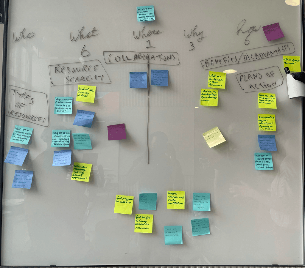
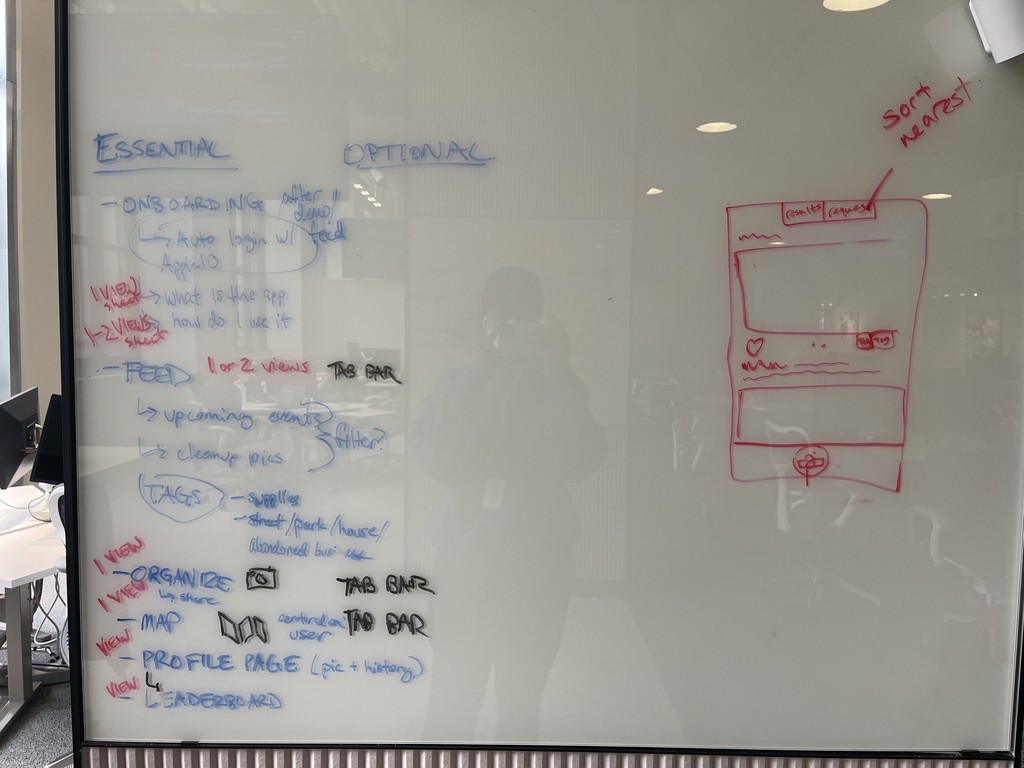
Brainstorming + Sketches
Competitor Analysis


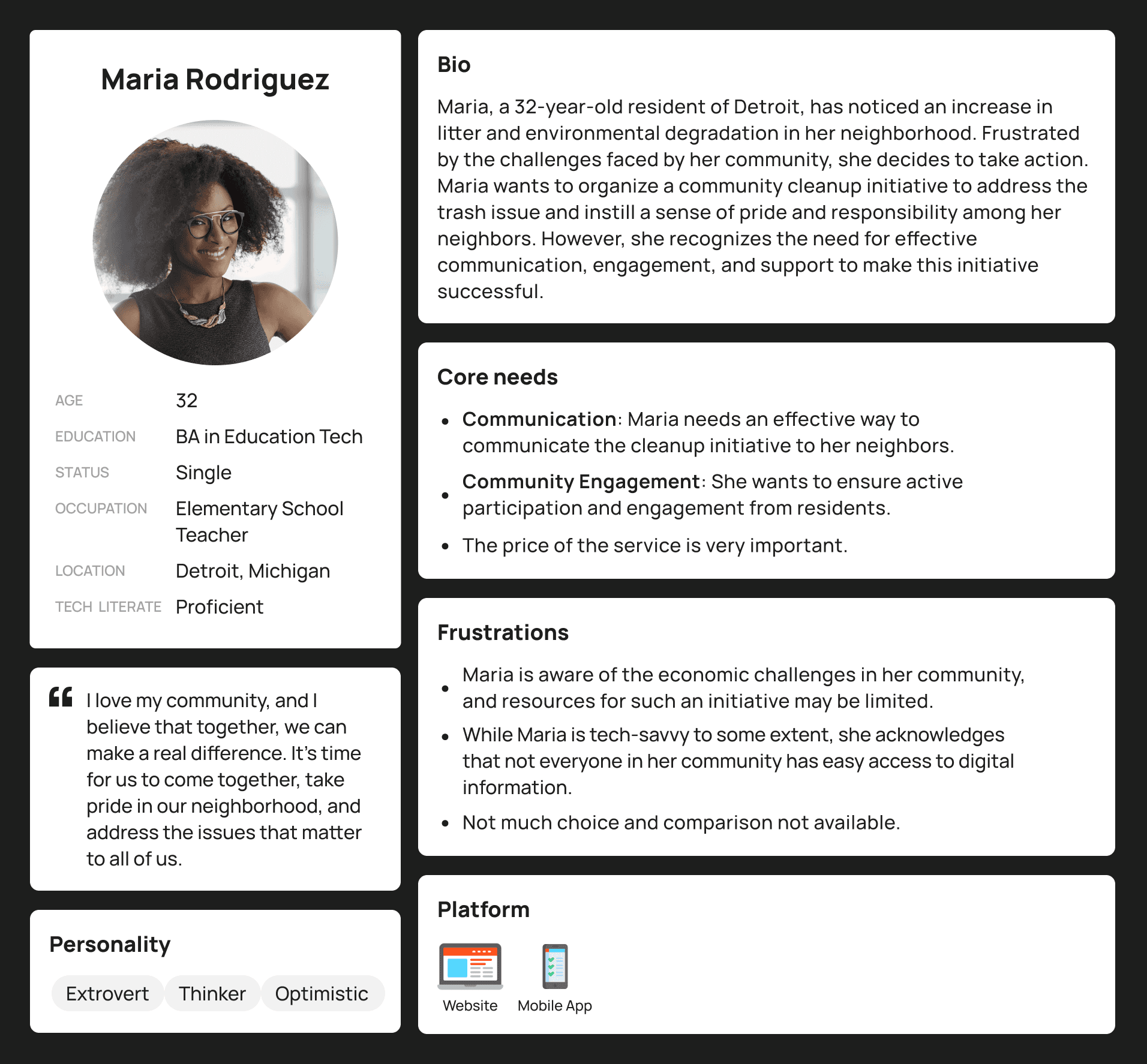
User Personas

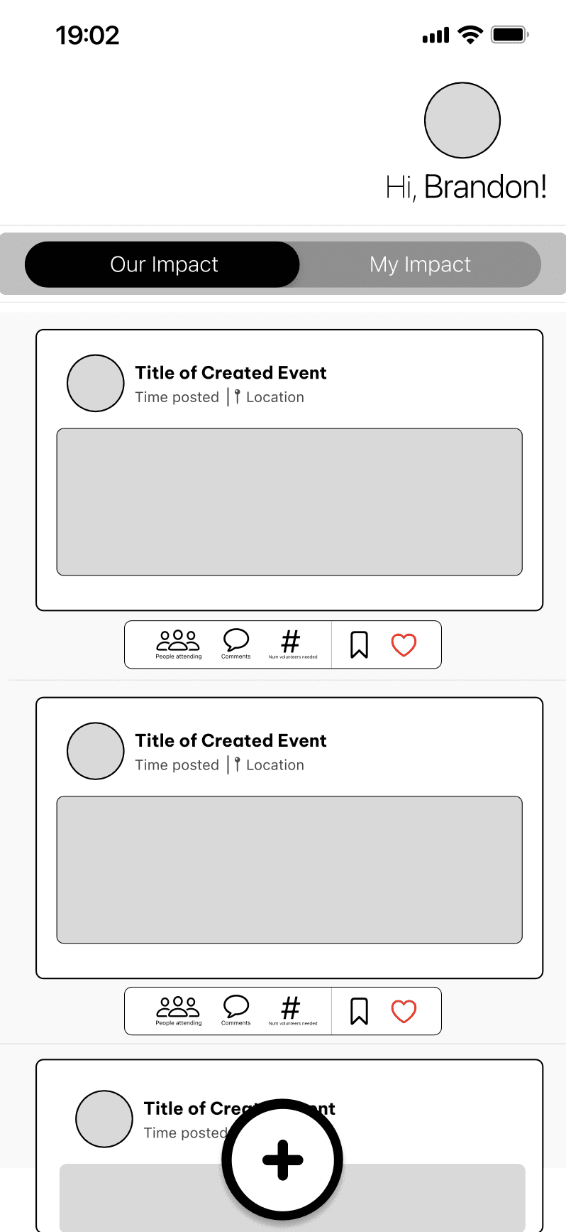
Wireframes

Usability Testing + Findings
In this section, we assess the effectiveness and intuitiveness of the app’s design. We gather feedback from users on navigation, layout, and overall user experience to identify areas for improvement and ensure a seamless, user-friendly interface.
We asked participants to complete four tasks to evaluate where they would most likely click first when attempting to accomplish each task. In the end, we also gathered input from users by asking if there were any navigational elements, design features, or other aspects of the interface that they found missing, difficult to use, or in need of improvement. This feedback helped us identify potential areas for enhancing the overall user experience.
Results
Reflection
Interactive Demo